Internet history: what today's top UK websites looked like in the noughties

Jun 2017 ⋅ 6 min read

Technological nostalgia is a very real phenomenon.
Some of us get all misty-eyed at the dissonate sound of connecting to the internet via dial-up. Others look back on the days of Ski-Free and the Windows maze screensaver with real fondness.
As we've moved from punched tape to floppy disks to CDs and USB drives, other aspects of our digital lives have also moved on.
Nowhere is that more obvious than online.
Our favourite websites have changed so rapidly over the past 10-15 years that they're barely recognisable. Let's take a look back through the Internet's history and find out how terrible amazing websites were in the noughties!
Before we start...
We couldn't have published this article without Archive.org's Wayback Machine - it's the source of all of the old screenshots we used in this post. Go check it out if you want to study the web's history yourself!
One more thing - the nature of the archiving process means that sometimes pages don't look quite right - they might have missing or broken images, or the page's stylesheet might not have been applied. However, the overall structure of the page should be identical to the archived page's actual layout all those years ago.
With that out the way, let's start.
Amazon.co.uk
2000

2017
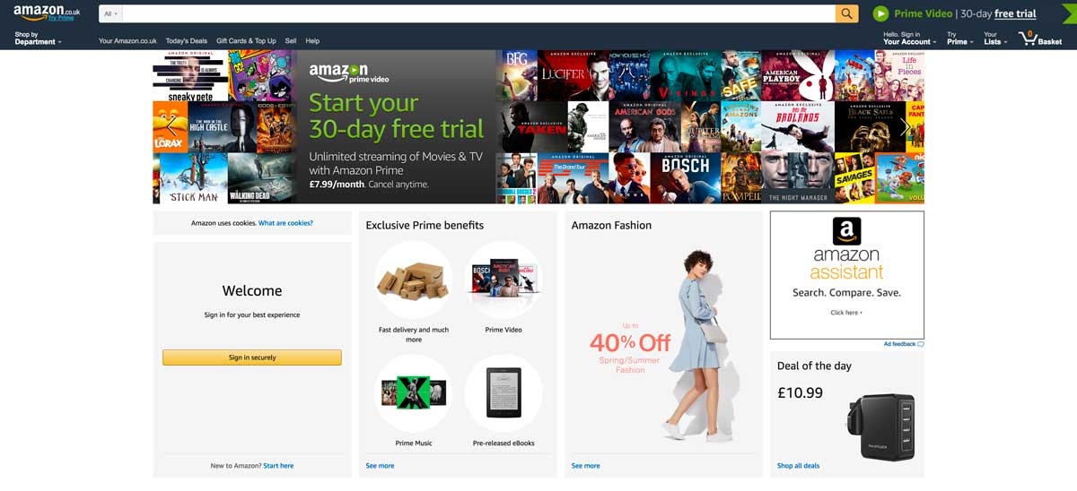
What's changed?
Amazon was early to the world of e-commerce, and its 2000 homepage certainly looks dated. Today, the site's focus is on pushing both its Prime service and the action of registering or signing in. Personalised recommendations are, of course, essential to Amazon's continued success.
eBay.co.uk
2000

2017

What's changed?
Everything. eBay's homepage is now highly visual, and it looks more like a standard e-commerce retailer than a place for individual listings. The 2017 page is less cluttered, easier to navigate, and doesn't feature those odd capitalisations in the middle of headers!
BBC Homepage
2001

2017

What's changed?
Between 2001 and 2017, the BBC switched its homepage to a more 'traditional' news website, with the focus very much on its journalistic output instead of the numerous resources it offers visitors - at least in the top part of the page. Another notable addition is the ability for users to sign in and customise their BBC homepage.
The Telegraph
2002

2017

What's changed?
The alphabetical sidebar has disappeared. We can also see space dedicated to premium content, reflecting the move by many newspapers to monetise their online content.
Wikipedia
2004

2017
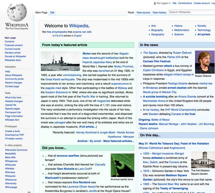
What's changed? At first glance, very little. Some of the sections have switched position on the homepage, but the only significant change is that the sidebar is far more populated than it once was. This is down to the site's expansion rather than a design choice. But the 'old-school' layout doesn't matter too much for Wikipedia - users don't spend long on its homepage. The structure and design of individual articles are far more important.
The Guardian
2004

2017

What's changed?
The Guardian have switched the structure of their content from a list to a grid (on desktop, at least). The page is less busy, and there's a definite colour scheme now instead of the jumble of colours we saw in 2004.
ITV
2004

2017

What's changed?
Most obviously, the bright blue background has been replaced by something a little easier on the eyes. There's more space dedicated to live content, and less space set aside for programme previews and listings. News also takes a back foot. Finally, we see the 'blocky' layout replaced by a cleaner page design.
Rightmove
2004

2017

What's changed? We think the most significant change between the site's incarnations is how they've used white space. The old website lacked space between each element, but today's site understands that white space in the right places makes for a more pleasant user experience, helping us navigate the site and find what we're looking for more easily.
Digital Spy
2004

2017

What's changed?
Digital Spy has been one of the UK's most popular entertainment news sites and communities for 15 years, but its homepage is a sign of how much has changed online in that time. While news is still front and centre, now each story is accompanied by its own image. One of the sidebars has gone, resulting in a cleaner layout that's better suited to viewing on mobile devices.
HMRC
2005

2017
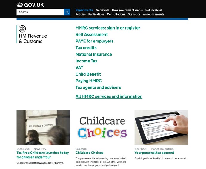
What's changed?
HMRC's website merged with Gov.uk website earlier this decade, and the site now shares its minimalist (award-winning) design. It sticks out like a sore thumb on this list given that the new website is text-heavy - which makes sense given that the HMRC site needs to be functional above all else. It's certainly easier to find what you're looking for, at a glance, than it was on the 2005 site.
RotaCloud
OK, so we weren't around in the noughties - but here's a slice of RotaCloud history...
2014

2017

What's changed?
Even in three years, the RotaCloud homepage has changed significantly. We now show off some of our clients right near the top of the homepage, and RotaCloud blue (as we call it!) plays a more dominant role - we want our brand to stand out amongst similar sites - the old homepage was perhaps slightly generic!
Lessons learnt
The web pages of the noughties might be laughable compared with today's sleek, responsive designs, but at the time, those designs were perfectly adequate.
Back then, websites were optimised for 640x480 or 1024x768 PC monitors with no need to worry about mobile devices or responsiveness.
Sites were text-heavy back then because internet connections were slow and unreliable. Sure, we would have loved to see amazing visual content on websites in the early noughties, but it wasn't practical. Who has the patience to wait five minutes to view a single high-quality image online as the data crawls through a phone line?
As our internet connections have improved, the role of text diminished to give way to images, videos, and audio content. In other words, technological advances allowed us to view the content we wanted to see all along.
Another big change you'll have noticed between the new and old websites is the addition of 'sign in' and 'register' options, even on non-e-commerce sites. This change reflects the growing personalisation of content on the internet, as well as the wider role of online services in our daily lives. The internet is no longer just a place to go to obtain information - it's a place to talk, learn, and manage pretty much every aspect of our lives.
Over to You
How have your favourite websites evolved since they first started? Head over the Wayback Machine to find out!
